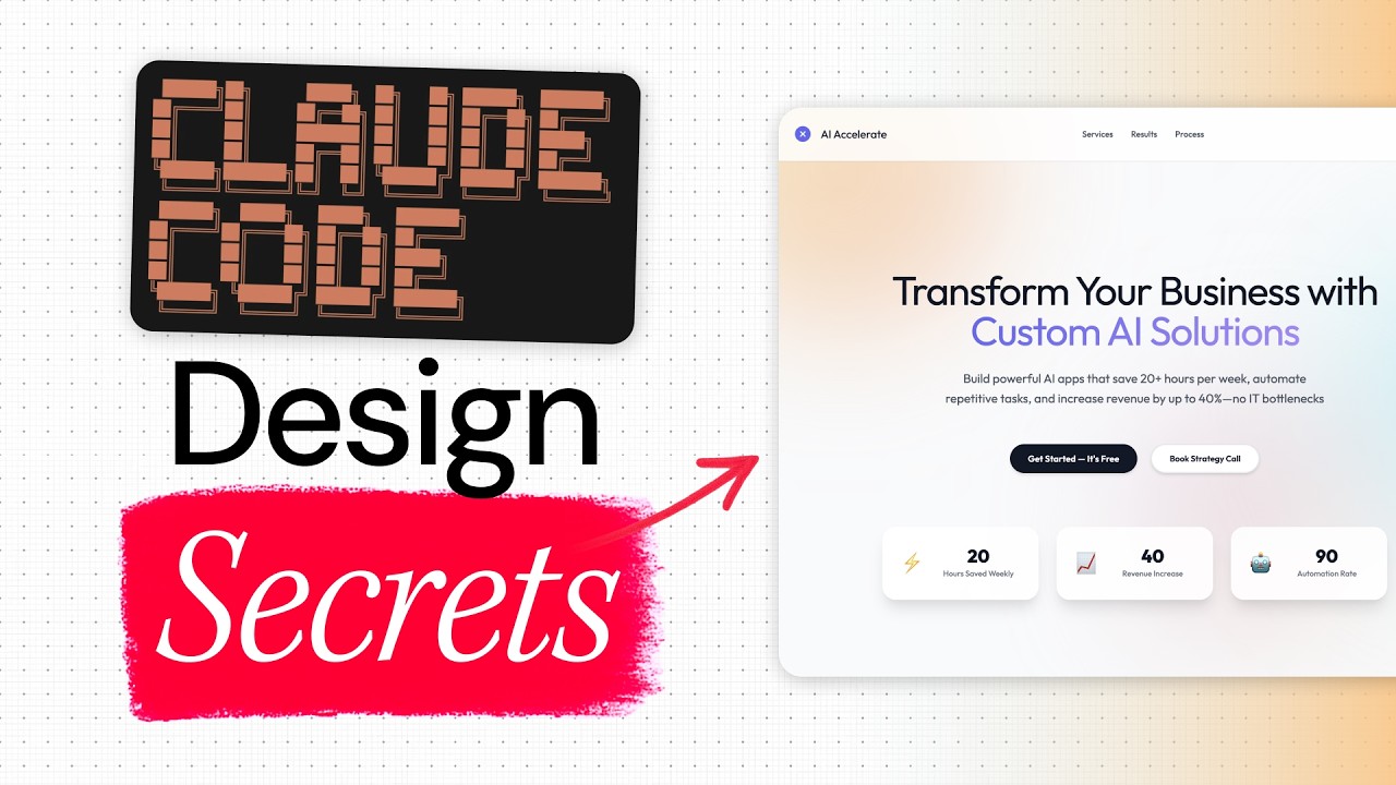
# How to Build ACTUALLY Beautiful UI in With This Claude Code Skill
Table of Contents
These notes are based on the YouTube video by Build Great Products
Key Takeaways
- The Claude Code front‑end design skill can upgrade a bland AI‑generated page into a much cleaner UI with just a prompt.
- Installing the skill is a simple local‑file configuration step inside your Claude Code project (not a copy‑paste “marketplace” command).
- The skill works out‑of‑the‑box in the sense that it can produce a decent design without a detailed brief, and it can also follow a reference screenshot for more specific styling.
- In the creator’s demo, results consistently move from “generic AI purple gradients” to clean, high‑contrast layouts with better typography, subtle animations, and cohesive color palettes.
- You can further improve outcomes by:
- Adding explicit design cues (e.g., CTA prominence, brand colors).
- Supplying a design system or style guide for the skill to reference.
- The demo shows that a few minutes of setup can replace hours of manual UI work, making professional‑level design accessible to developers who aren’t designers.
1. Setting Up the Front‑End Design Skill
-
Open Claude Code in your development environment (the video uses the Cursor IDE).
🔗 See Also: Claude Code best practices
-
Add the skill to your project – the current supported method is to place the skill definition in a
skillsfolder inside the Claude Code workspace. For example:/my‑project└─ skills/└─ front‑end‑design/├─ SKILL.md└─ ... (prompt templates, assets)Alternatively, if Anthropic releases an official marketplace UI, you would enable the skill through the Claude Code settings panel.
-
Activate the skill by referencing it in a Claude Code chat prompt (e.g., “@front‑end‑design …”). Claude will then load the skill’s prompt bundle and respond accordingly.
Create distinctive production‑grade front‑end interfaces with high design quality. Generates creative, polished code that avoids generic AI aesthetics.
2. Using the Skill Without Extra Guidance
-
Prompt example (to improve an existing landing page):
@front‑end‑designUse the front‑end design skill to improve the design of this landing page. -
Result (as demonstrated by the creator):
- Cleaner typography, consistent padding, and subtle hover/scroll animations.
- A restrained palette (black, white, plus a single accent color) that feels professional and adaptable.
- Minor issues may remain (e.g., CTA button blending into the background, a few mis‑aligned cards).
-
Takeaway: Even a bare request yields a noticeable upgrade over the default AI‑generated UI, though the output still benefits from a quick visual review.
3. Guiding the Skill with a Design Reference
-
Find a reference UI (e.g., a Dribbble shot of an AI‑agency site).
-
Copy the screenshot to the clipboard or save it to a file that Claude Code can access.
-
Prompt the skill with the reference:
@front‑end‑designUse the front‑end design skill to improve the design of this landing page, following the attached screenshot. -
Outcome (as shown in the video):
- A shift from a “brutalist” look to a soft‑modern aesthetic: pastel gradients, rounded corners, subtle shadows, and smooth transitions.
- Font family changes to a modern sans‑serif (e.g., Outfit).
- Iconography swaps from emojis to geometric icons (though occasional fall‑backs to emojis can still appear).
- Overall visual hierarchy and spacing improve dramatically, despite a few leftover formatting quirks.
Clarification: Claude Code’s ability to ingest screenshots is documented in Anthropic’s best‑practice guides, so this workflow is officially supported.
4. Observations on Design Quality
| Aspect | Before Skill | After Skill (no reference) | After Skill (with reference) |
|---|---|---|---|
| Color scheme | Default purple/blue gradient | Black‑white‑accent (single color) | Pastel gradients + cyan accent |
| Typography | Basic, unstyled | Improved hierarchy, better fonts | Modern sans‑serif (Outfit) |
| Shadows & Depth | Harsh, flat | Soft glow, consistent elevation | Rounded shadows, blur effect |
| Animations | None | Fade‑in on scroll, hover effects | Smooth transitions, underline animation |
| Iconography | Emoji‑style | Consistent UI icons | Geometric icons (fallback to emojis) |
| Layout | Simple grid, some mis‑alignments | Better padding, cohesive sections | Rounded cards, fluid grids |
What still needs manual tweaking:
- CTA button contrast (make it a primary color).
- Text alignment in certain sections.
- Icon rendering issues in some components.
5. Extending the Workflow
- Design System Integration: Create a reusable design system (variables for colors, spacing, typography) in your codebase, then ask Claude Code to respect that system when generating UI.
- Iterative Prompting: After the first redesign, you can issue follow‑up prompts like “Make the CTA button stand out more” or “Replace the emoji icons with SVG icons from the design system.”
💡 Related: How Claude Code Hooks Save Me HOURS Daily
- Batch Generation: Use the skill to scaffold multiple pages (pricing, dashboard, onboarding) by providing brief descriptions or additional screenshots.
🔗 See Also: 5 Claude Code MCP Servers You Need To Be Using
Summary
The Claude Code front‑end design skill dramatically shortcuts UI creation. By adding the skill’s definition to your project and issuing a concise prompt—either generic or anchored to a visual reference—you can upgrade a rudimentary AI‑generated page to a professional‑looking interface in minutes. The tool excels at establishing a clean visual language, adding subtle animations, and handling typography, while still allowing targeted manual refinements (e.g., CTA prominence). Pairing the skill with a custom design system or iterative prompts can push the output even closer to a fully polished product, making high‑quality UI accessible to developers without deep design expertise.

