# 7 Proven Steps to Build a MILLION DOLLAR Landing Page
Table of Contents
These notes are based on the YouTube video by Wes McDowell
Understanding the Purpose of a Landing Page
A landing page is a single, focused page designed with one specific purpose: to convert a visitor into a lead. Unlike a typical website, which can be overwhelming with too much information, a landing page removes distractions and creates a clear path forward for potential customers. Many industry datasets show average landing page conversion rates around 2–3%, while top-performing pages often achieve 5–10% or higher, depending on industry and traffic source. This highlights the importance of optimizing your landing page for maximum conversions.
Step 1:
🎨 Related Guides: Also check out how to create the perfect homepage and designing landing pages that convert with AI. Define Your Target Audience To create a high-converting landing page, you need to understand exactly who you’re talking to. This means going beyond basic demographics and understanding your audience’s specific problems, desires, and the words they use to describe what they’re looking for. When you truly understand your audience, every other decision becomes easier, including writing a headline that speaks directly to their needs.
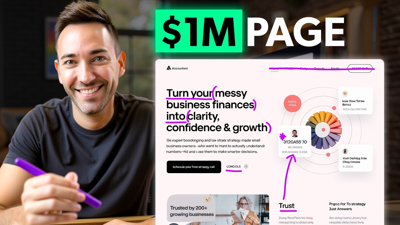
Crafting a Powerful Headline
A headline needs to be clear and relevant, stating exactly what you offer and speaking directly to what your visitor wants. A strong, clear headline can dramatically increase conversions; in some A/B tests, headline changes have produced double or even several-times-higher conversion rates. Results vary widely by audience and offer. Compare these two headlines:
- “It’s about time” (vague and uninformative)
- “Generate and publish your site with AI in seconds” (clear and descriptive)
The Importance of Benefit-Focused Copy
Service businesses often make the mistake of listing features without explaining what clients actually get out of them. Instead, use benefit-focused copy by asking yourself, “So what?” For every feature, translate it into a benefit that shows how it will improve the client’s life. Benefit-focused copy often significantly outperforms plain feature lists in engagement and conversions, according to many conversion optimization case studies, though the exact lift varies by situation.
Creating a Clear Call to Action
Avoid overwhelming visitors with multiple calls to action, as this can hurt conversions. Case studies show that simplifying pages and focusing on a single primary CTA can produce very large conversion lifts (sometimes several hundred percent relative improvement), but the exact impact varies by page and audience. Instead, create one obvious next step that stands out visually. Remove navigation links and distractions, keeping visitors focused on the one action you want them to take.
Building Trust with Your Audience
To overcome doubt and build trust, use trust elements such as:
- Testimonials with real names and photos (in at least one study/case study, adding testimonials with real names and photos increased conversions by up to about 34%; results will vary by business)
- Credentials and guarantees
- Logos of clients or professional associations
- Trust badges near forms These elements work together to build credibility and make visitors feel comfortable taking the next step.
The Power of Good Design
Design matters, with 94% of first impressions being based on how your page looks. Create a visually organized page with a clear hierarchy, using:
- Plenty of white space
- Easy-to-read fonts
- Consistent colors
- Relevant images that support your message Good design guides the eye strategically through your page, increasing conversions by 20-50% compared to cluttered designs.
Optimizing for Mobile and Speed
Most visitors will access your landing page from their phones, so it’s essential to ensure it looks good and functions well on mobile devices. Additionally, speed is crucial, with pages taking longer than a second to load losing up to 7% of traffic. Use modern website builders that handle mobile responsiveness automatically, and take simple steps to optimize your page, such as:
- Optimizing image sizes
- Keeping your page design straightforward
- Using a faster hosting provider with a CDN (such as Hostinger)
Summary
To build a high-converting landing page, follow these 7 proven steps:
- Define your target audience
- Craft a powerful headline
- Use benefit-focused copy
- Create a clear call to action
- Build trust with your audience
- Use good design principles
- Optimize for mobile and speed By following these steps and avoiding common mistakes, you can create a high-converting landing page that turns visitors into paying clients.
AI Landing Page Evaluation Prompt
Use this comprehensive prompt with any AI system (ChatGPT, Claude, etc.) to evaluate your landing page against the 7 proven steps:
# Landing Page Evaluation Request
Please evaluate my landing page based on the 7 proven steps for creating high-converting landing pages. Provide a score (1-10) for each criterion along with specific, actionable feedback.
**My Landing Page**: [Insert URL or paste content here]
---
## Evaluation Criteria
### 1. Target Audience Definition (Score: _/10)**Evaluate:**- Does the page clearly identify and speak to a specific target audience?- Does the copy use language and terminology that resonates with that audience?- Is the audience's specific problem or desire addressed?- Does it go beyond basic demographics to address deeper needs?
**Specific Feedback:**- Who is the current target audience (if identifiable)?- What improvements would make the targeting clearer?- What specific pain points or desires should be emphasized?
---
### 2. Headline Power (Score: _/10)**Evaluate:**- Is the headline clear and immediately understandable?- Does it state exactly what is being offered?- Does it speak directly to what the visitor wants?- Is it specific rather than vague or clever?
**Specific Feedback:**- What works well about the current headline?- What specific improvements would make it more compelling?- Provide 2-3 alternative headline suggestions that would increase clarity and relevance
---
### 3. Benefit-Focused Copy (Score: _/10)**Evaluate:**- Does the copy focus on benefits rather than just features?- For each feature mentioned, is the "so what?" answered?- Does the copy explain how the product/service improves the client's life?- Are benefits tangible and specific?
**Specific Feedback:**- Identify any features that need to be translated into benefits- Provide specific rewrite suggestions for the most important sections- What key benefits are missing that should be highlighted?
---
### 4. Call to Action Clarity (Score: _/10)**Evaluate:**- Is there one clear, primary call to action?- Does the CTA stand out visually?- Are there competing CTAs that create confusion?- Is navigation minimized or removed to maintain focus?- Is it obvious what the next step is?
**Specific Feedback:**- How many CTAs are present? (Should be 1 primary)- What distractions should be removed?- How can the primary CTA be made more prominent?- Suggest specific CTA button text improvements
---
### 5. Trust Building Elements (Score: _/10)**Evaluate:**- Are there testimonials with real names and photos?- Are credentials, certifications, or guarantees displayed?- Are there logos of recognizable clients or professional associations?- Are trust badges present near forms?- Do trust elements feel authentic and credible?
**Specific Feedback:**- What trust elements are present?- What trust elements are missing?- How can existing trust elements be improved?- Where should additional trust signals be placed?
---
### 6. Design Quality (Score: _/10)**Evaluate:**- Is there a clear visual hierarchy?- Is there adequate white space (not cluttered)?- Are fonts easy to read and professional?- Are colors consistent and appropriate?- Do images support the message rather than distract?- Does the design guide the eye through the page strategically?
**Specific Feedback:**- What design elements work well?- What specific design improvements are needed?- Are there cluttered areas that need simplification?- Do images enhance or detract from the message?
---
### 7. Mobile & Speed Optimization (Score: _/10)**Evaluate:**- Is the page mobile-responsive?- Does it function well on mobile devices?- Does the page load quickly (under 1 second)?- Are images optimized for size?- Is the design straightforward enough for mobile?
**Specific Feedback:**- Identify any mobile usability issues- What elements may be slowing down load time?- Specific technical optimizations recommended- Are there any mobile-specific layout problems?
---
## Overall Assessment
**Total Score: _/70**
**Overall Conversion Potential:**- Current estimated conversion rate: _%- Potential conversion rate with improvements: _%
**Top 3 Priority Improvements:**1. [Most critical change needed]2. [Second most important change]3. [Third most important change]
**Quick Wins:**- List 3-5 small changes that could be implemented immediately for quick impact
**Long-term Recommendations:**- List strategic improvements that require more time/resources
**Estimated Impact:**- If all recommendations are implemented, estimate the potential conversion rate improvement
---
Please be specific, actionable, and prioritize recommendations based on potential impact on conversion rates.